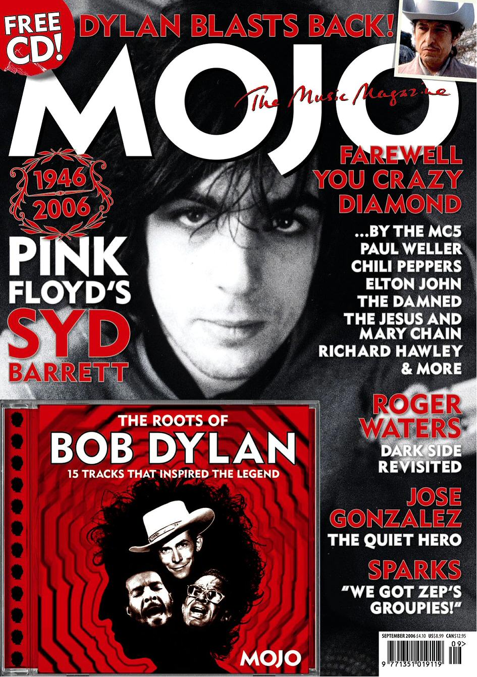
This is the cover of Mojo Magazine for the month of September 2006. The first thing I notice is the use of very little colour. Everything is black, white or red in terms of the images and the fonts. I think red is used a lot on this front cover as it has strong connotations of power, passion and energy. Red is known to stand out more than any other colour. This is useful for grabbing the attention of the buyer. The Brand logo/masthead is in a bold white font to be able to stand out against the darkest part of the black and white image in the background. There is a tagline, again in red, across the top of this reading 'The Music Magazine'. The rest of the font is in a similar bold fashion and looks exactly the same all over the cover except the changes in font size.
The background and main images takes up the whole cover and so the text and other images have to work well around it and be positioned so that they are easy to read. In the image Syd Barrett is looking straight at the camera. This is to create a connection with the buyer when they see the magazine in stores. If he wasn't looking at the camera it wouldn't have the same dramatic effect.
The language on the cover is pretty simple and straight forward and all refers to artists and music. There are puns like 'Farewell you crazy diamond', which is a play on words of the title of a Pink Floyd song. This is to attract the fans of their music. To anyone who didn't know the song it would mean nothing. This shows it's trying to create a direct connection with the target audience and not with anyone else. There are also examples of alliteration in 'Dylan Blasts Back'. This makes the sentence more fun and memorable, creating an even greater impact on the reader.
The whole cover speaks to the specific target audience. As it is directed more towards men the boldness of the fonts and colours reflect that. The cover is simple and effective and therefore is accessible to anyone who likes that kind of music and can be related to by a range of ages.

This is a recent cover of Uncut magazine featuring Neil Young. Although there are more colours being used here it is still pretty basic and primarily features black, white and red again. Again the red has the same connotations and in this case is used as the colour of the title font and stands out effectively against the black and white image.
A lot of other things are similar between the two magazines. Again in this one Neil Young is looking straight at the camera. It features a very similar use of words at the top of the cover, ' Springsteen’s back', in exactly the same position of 'Dylan Blasts Back' on the Mojo cover and similar positioning of the image next to it. They both also feature a free CD and a small label-like graphic in the top left hand corner showing that. All of this shows that this style and genre of magazine follow a very similar scheme of layout and colours. I will defiantly refer to these two for ideas for my own cover. Also after having looked at a few examples of other covers in my research including, NME and Q it is clear that red is the most common colour and I will defiantly incorporate it into my own cover.

This is the contents page from a recent issue of Mojo.
The first thing I notice is the magazine name/logo again reinforcing it's identity to the reader. Again the colours are simple and are not different from those used on the front page; red, white and black. All the artist names and the information along with it is written in white to stand out against the black and enable the reader to recognise the names of their favourite artists more clearly. The other main point of the contents page is the image. This is important as it shows a different artist to that on the cover (in this case Kings of Leon). His name, 'Trent Reznor' is next to the image along with a page number so you know exactly where to go in the magazine if you want to see that particular article. There is also a quote from the artist to give you a taste of the genre and topic of the interview. In terms of the layout of the text on the contents page it is very linear and easy to follow and is left aligned. It also seems like the text is fitting around the outline of the image. It fits together well and looks clean and professional.
This is a double page spread from Mojo magazine. It includes the introduction and the beginning of an article on Justin Vernon of Bon Iver.
The main features of the article which stand out first are the image and heading. The image takes up most all of one of the pages and almost half of the other. This shows the importance the image has on the reader. It lets you know who or what the article is about in an instant, which the title doesn't always do. The heading on this example 'American Gothic', relates to the style of the artist and the style of the rest of the layout. Everything matches together under one theme to create a whole and complete representation of the artist. Black and white is the main colour scheme as again it matches the gothic theme and the B&W image. There is also a small use of a dark gold-like colour to add emphasis to certain words including the artists name and writer’s name. There are only two font styles on the page. The first is a messy, gothic type writer style font. This features on the main title and on the sub heading/introduction. This stands out from the rest of the simple and smaller text in which the rest of the article is written. The fact that it is simple and minimal makes more attractive to look at more professional. The introduction must stand out and use emotive language to get you to read the rest. It uses words like 'magical' to create an image and to again relate to the gothic feel to the piece. I notice that on a lot of articles it starts with a quote from the interviewee. The buyer is going to recognise the artist straight away if it is an artist they know. But for those who don't the use of a continuous theme and an attractive and simple layout, which is easily relatable to the male target audience, will persuade you to read and learn about the artist.
Click all images to see la
 rger.
rger.
No comments:
Post a Comment